OPINION: The Pixel 7 is an excellent handset, but is it, unfortunately, let down by one of its most visually striking features?
I have thoroughly enjoyed my time reviewing the Pixel 7, Google’s latest smartphone. Not only does it offer the excellent photography skills that we’ve come to expect from the range, taking breathtaking shots in a variety of different lighting conditions, but it’s also got a good screen and a slick design, making it a truly tempting prospect given its relatively affordable price tag.
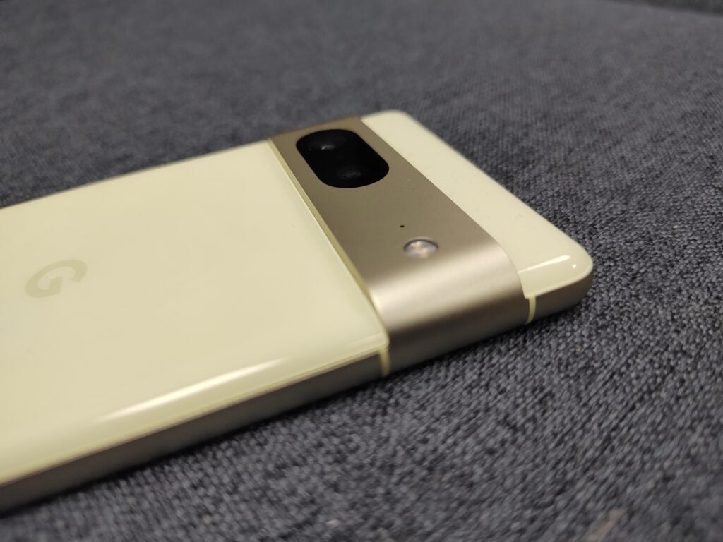
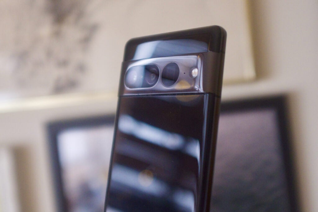
However, on that last point – the slick design – I do have one reservation. And it’s such a nitpicky problem that you might not think it not worth mentioning at all; yet I think that it’s exactly that kind of day-to-day irritation that can disproportionately colour your experience of a product. I’m talking about the flashy, metallic camera bar that wraps around the back of the handset.

When unveiled, this was the physical and aesthetic feature that garnered the most attention; it was, seemingly, a strong upgrade over the rather characterless black bar that adorned the Pixel 6, instead lending a touch of class and the air of a premium product. I still think those impressions hold absolutely true for the device’s looks, but it’s a different story for the ergonomics.
What you might not have realised when the device was unveiled was that this camera module protrudes quite a lot out of the back and, more significantly, has very hard edges with almost-sharp right angles rather than smoothed-out curves. There are a few different issues that this presents when you’re using the phone.
Firstly, those hard edges act as little shelves for dust, which quickly and easily collects in the right angles and is not easy to get out with a quick wipe. That’s a shame because it detracts from the otherwise very classy appearance of the handset, which has a smooth and glossy rear panel in several different subtle colourways.
Secondly, it causes a bit of a snagging hazard too. While for me at least the bar sits just above where I put my finger when holding the phone, and therefore doesn’t irritate me, I have noticed that when shoving the phone into or out of my jeans pockets, it can often snag on the lining.
Finally, in common with other phones that have prominent camera modules, this does mean that the handset won’t sit flat on a surface if you lay it on its back. However, I consider this of much lesser importance to general usability.
In my experience, the smoothed-out, more subtle camera bumps that you find on some other flagship phones (such as the Oppo Find X5 Pro) don’t encounter these problems at all, so I’ve found it a little baffling that Google has torn up the design rulebook only to introduce a couple of ergonomic pitfalls which are very obvious even after a few hours of using the handset.

Could a case solve these problems? Perhaps, but I’ve got two responses to that query; firstly that case should always be considered an optional purchase, not a necessary one to overcome an inherent design flaw on the product; and secondly that the actual case Google has manufactured for the phone still leaves significant crannies at the corners for dust to collect.
It’s not like Google is the only offender here of course, when it comes to making design choices that have a negative day-to-day impact. For example, Max Parker noted in his review of the iPhone 14 Pro Max that the flat-edged screen, measuring a massive 6.7-inches, is far less comfortable to hold than it would have been if the edges had curved around the sides (as we’ve seen on the likes of the OnePlus 10T, or the Honor Magic 4 Pro).
You might give these complaints short shrift, believing that processing power or camera performance are far more important. Well yes, these are key attributes that define the capabilities of such devices, but physical features that irritate you every time you use your phone not only detract from your enjoyment of the phone (even one that is otherwise as charming as the Pixel 7), but we should be expecting better; given the amount of money and research that goes into smartphone design, I remain baffled that such elementary problems still arise.


