
Game Developer Deep Dives are an ongoing series
with the goal of shedding light on specific design, art, or technical
features within a video game in order to show how seemingly simple,
fundamental design decisions aren’t really that simple at all.
Earlier installments cover topics such as UI and difficulty levels in Cook Serve Forever, the challenges of programming for 2D for Sweet Transit, physics-based animation in Gibbon: Beyond the Trees, and designing spatial inventories in dark fishing sim Dredge. In this edition, Matthew Chovan, solo developer on Mind Palace explores the design and technical creation of impossible spaces in an M.C. Escher-inspired game jam game.
I am Matthew Chovan, a solo game programmer and designer. In my free time, I work on small indie games, and my last published project was a game called Mind Palace. It’s a very short puzzle exploration game that I initially made for a game jam. Shortly after the game jam ended, I remade the game into its second version because I was not satisfied with the puzzle design and the narration. I found it to be very self-pitying, which was never my intention, so I decided to rework the whole design (levels, puzzle, and narration) from scratch. In this article, I will focus mainly on the game’s second version.
The main motivation behind Mind Palace was to take a very personal experience and put it into a game. I grew up very introverted, and talking to people was and still is not my strong side. I want to open up and communicate with people, but I just don’t know how. Eventually, I figured out that games allow me to communicate with people and as a bonus for me, it does not involve any of the awkward social aspects that normal communication has.
The Game Design
I look at game design as something holistic, rather than something isolated from programming or visuals. By holistic I mean everything, the visuals, sounds, programming, or even placement of objects. To me, these are all very important parts of game design and should go hand in hand. While working on small games, I figured out that every detail I put in has to be there for a reason, otherwise it has to be removed. It takes away unnecessary distractions and forces me to think about the ideas these details communicate, and whether those ideas are interesting enough to be left in the game.
The main inspiration for Mind Palace originated from art made by Dutch graphic artist M.C. Escher. The art with impossible or “weird” geometry always fascinated me, and I tried to put parts of his art I like and the feeling I get from them in Mind Palace. Inspiration also flowed from games like Antichamber or Manifold Garden, which do a much better job at composing the environment of impossible space.
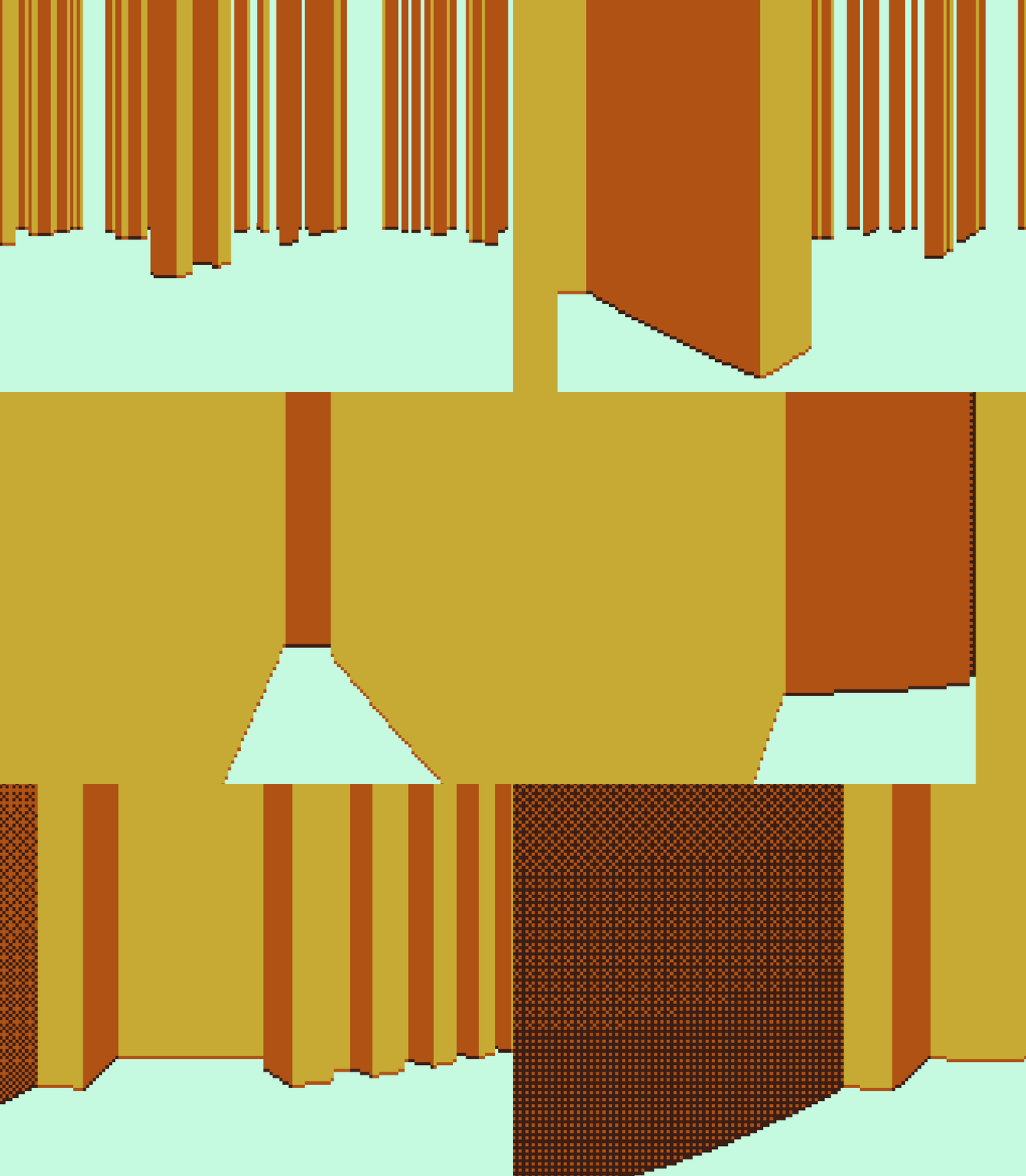
The game itself is separated into two parts, which was something I wanted to do from the beginning. The first part acts as a basic game with Sokoban mechanics, not featuring any impossible space. I called this part the “Conscious Mind”. Everything is clear, and colorful and nothing surprising or unexpected happens. The second part is called, as you can guess, the “Unconscious Mind”, which is something entirely opposite to the first part. Everything is gray, the space sometimes does not make sense, and it involves more exploration than puzzle solving. It all goes with an analogy to what I think a real unconscious mind is like. A place where people need to go and explore much more intensively, encountering unexpected and twisted images with a contrast to the conscious mind, where everything is easily accessible and to some degree understandable.
Puzzles
I always liked puzzle games and appreciated it when a good puzzle game tries to communicate interesting ideas via puzzles, which is also something I try to put in my games. Mind Palace is a Sokoban variant where the player needs to move boxes to goal positions. However, in this variant, players can also pull boxes, not just push them because I wanted to avoid implementing an undo system. It came to me as very strange in this specific game for players to be able to suddenly snap back several times in time. I wanted to recreate a specific feeling, which the undo system would destroy. From the beginning of the game, I teach players that the pull is very useful, so they do not get the need for an undo feature. Players need to fix their mistakes by moving boxes around instead of breaking the illusion by suddenly reverting everything.
However, the lack of an undo system made everything harder. The level design was much more difficult to execute, and it broke some technical aspects of the game. To be honest, I failed to design some levels properly because the game jam version had certain areas where players could get stuck by pushing boxes incorrectly. Since there was no undo action and no saves, there was no way to get unstuck other than resetting the whole game. In the game’s second version, I implemented checkpoints and a reset button, so players can reset to their last checkpoint. This also went against my philosophy of not breaking the flow of time, but the game required them to at least allow players to resume playing after turning off the game.
The Impossible Space
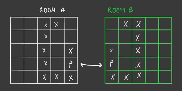
The impossible space was one of the interesting parts of my game, so I solved this before doing anything else. I ended up achieving the effect using invisible portals, which do seamless transitions between levels. Going through portals is not sophisticated at all. Basically, what happens is that the player does not actually teleport, but the map changes around them. Map loading was fast on this small scale, so this solution worked well. The downside of this approach was that maps that were connected by a portal needed to have the same tiles around the portals, so when the player “teleports” it looks seamless.
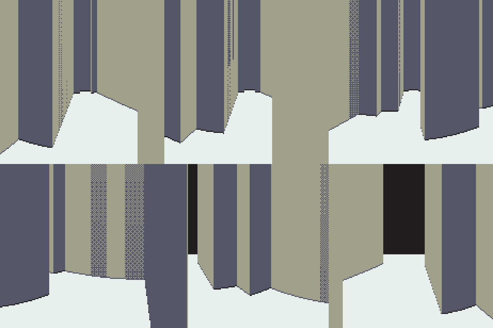
The original implementation allowed me to make only maps that looked like small rooms. I wanted to make some levels of the game in big halls (as it is located in a palace). I came up with a solution in a form of wrapping the world around itself. With this, I could create areas that seemed to repeat infinitely, which was something I would have never imagined I would create with this game.
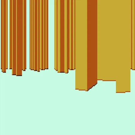
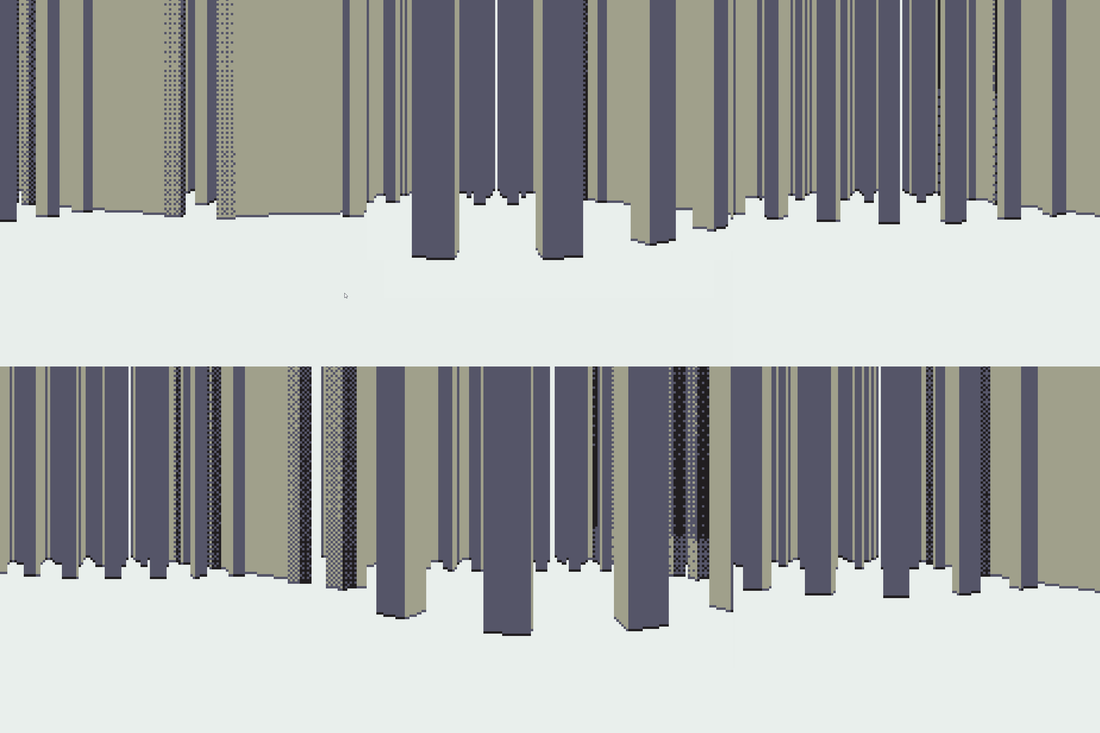
To create big halls or bigger rooms, I discovered that I can just connect two rooms with a big portal that covered the entire wall. I used this trick in many places to create more spatial rooms.
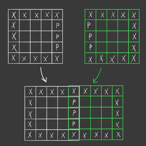
Maps were represented in memory as an array of bytes (C-like strings), where each byte represented a single tile. Since all maps were 16×16 tiles, it took up only 257 bytes (1 extra byte for zero-terminated character). Of course, each byte was represented by an ASCII character; for example, a wall was represented by an ‘x’, empty space with a dot ‘.’ or a goal tile represented by ‘g’. The iteration process on the level design was very easy and quick, thanks to WASM-4 hot loading feature, which loaded each change instantly.
The (Technical) Art
Mind Palace was made for the WASM-4 game jam. WASM-4 is a fantasy (software) console similar to PICO-8 or TIC-80. Each of these consoles has several limitations, and WASM-4 is no exception. Limitations such as 160×160 screen resolution with only 4 colors available, 64 KB of RAM, 1024 bytes of disk, and many more. This all looked very interesting because I think that technical constraints can be beneficial to the artistic product and direct artists towards interesting and creative outputs. Still, the limitation of 160×160 display resolution with only 4 colors made it very difficult to create a 3D environment. I needed to place details only on the important parts and not waste them anywhere. Too much detail on such a small screen resolution would result in an unrecognizable noise of pixel colors.
Raycast Rendering
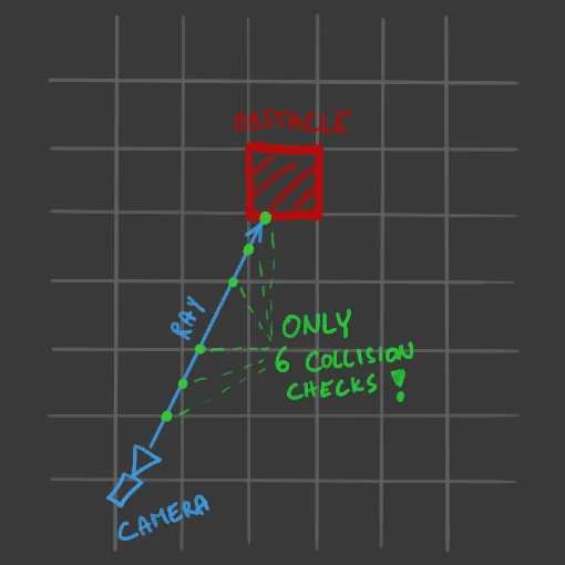
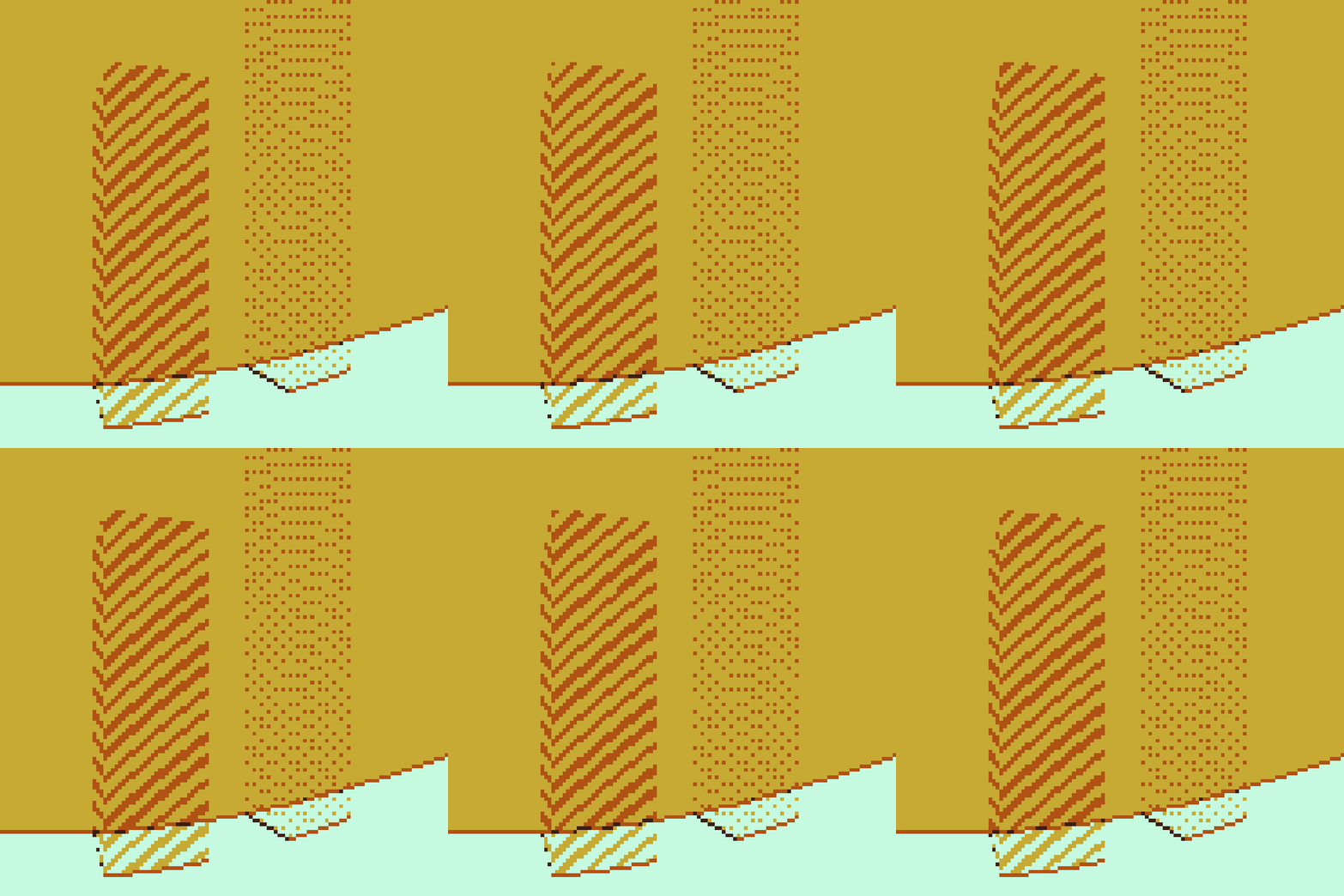
The rendering in Mind Palace is made the same way as in the Wolfenstein 3D game, using a common technique called raycast rendering. It is a process of casting many rays from a camera to the environment and drawing pixels based on what each ray hits. In my case, calculating ray collisions was very cheap, since my game was grid-based (2D). What I did was a very simple implementation of the DDA algorithm (similar to Bresenham’s algorithm for rasterizing lines), which results in very fast and effective collision checks. These checks were basically just a look-up in the tile map of whether the tile that is currently checked is something the ray can collide with.
The screen was limited to a width of 160 pixels, so the rendering code was hard-coded to this limitation. In a real raycast rendering, I would cast rays through each pixel on the screen to create the final image. However, in this game, I only needed horizontal resolution, since the game is 2D and everything is only stretched upwards based on each entity. For example, walls are always stretched to the top of the screen (so they appear infinite) and boxes or goals had a specified height which was calculated based on the distance to the player. The raycast renderer in Mind Palace draws in columns, meaning I cast 160 rays through each column of pixels on the screen.
To cast a ray, I picked a direction (based on the field of view angle) and the ray had to find all intersections along the way. The efficiency of collision checks on a grid allowed me to leave out all sophisticated sweeping or geometrical algebra. I just needed to check every edge along the way, which includes very cheap operations and a small number of look-ups. It also completely prevents tunneling (a very common issue in simple collision checking).
Each ray collected an array of hits it collided with until it intersected with a wall, or its lifetime was gone (to deal with casting a ray to infinity or through infinite loops). Then the renderer went through each hit and did the rendering back-to-front (the furthest entities were drawn first). In an ideal scenario, I would implement some kind of simple culling, but I was dealing with a 160×160 display, so the overhead of a culling system seemed bigger to me than just overwriting pixel color values in a simple array.
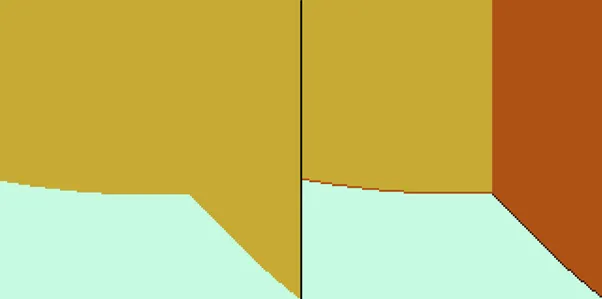
One thing that really simplified the technical implementation was that floors and ceilings do not exist (as in the Wolfenstein 3D game). I only had to figure out the wall rendering problem, and I wanted to focus on that. Textured walls were out of the question, because, well, color variety limitations. I needed to put details only where they mattered. However, I needed to visually distinguish different sides of walls and other entities because otherwise, it was very confusing and disorienting.
While implementing the back-to-front rendering, I realized that I can actually draw semi-transparent entities. It opened up some better level design opportunities because the player view could now be less obstructed and cluttered with solid objects. This was the problem in the game jam version because drawing only solid objects came out very claustrophobic to me, which was fine in some areas, but I did not want that feeling everywhere.
Drawing The Impossible Space
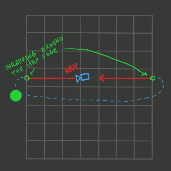
Since the whole rendering was based on rays, which traveled through the environment, the rendering implementation of the impossible space was not that difficult. I just took the rules I used with the player and applied them to rays. When a ray collides with a portal, it gets teleported and continues to travel to the other room until it hits a wall there or its lifetime runs out.
The endlessly repeating rooms are the same case. The world was wrapped around, so when the player stepped out of map boundaries, they got teleported to the opposite edge. When I applied the same rule to a ray, it ended up creating a nice endless space.
Dithering Effect
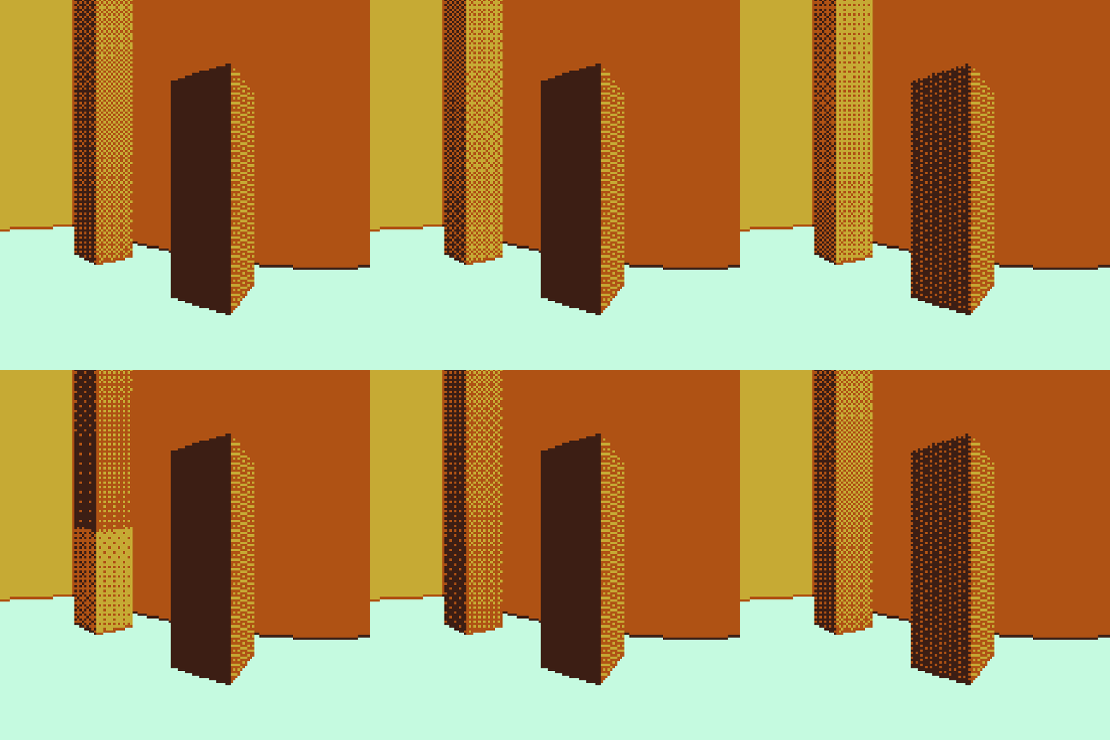
One of the challenges was to visualize that boxes are interactive and, most importantly, different from walls (remember, I had only 4 colors to work with). The dithering effect idea was accidental. I wanted to make waterfalls, and the dithering effect looked like something I could use. After implementing it, I liked it so much that I ended up using it on boxes, glass, and on waypoints (which is also the very first thing the player sees).
I took a threshold map, from which I derived the dithering effect. All this was done in screen space, so for each pixel, I took its coordinates, and based on them, I did the lookup in the threshold map. Then, based on the looked-up value, I just picked one of two colors. The threshold map was a 4×4 matrix (which can be found on Wikipedia). I precalculated the matrix values, to spare some CPU cycles.
Conclusion
The technical side of this game turned out fine, however, I tend to judge my projects very harshly, so on the level design and puzzle design side, I am not satisfied at all. I wanted to work on this game further at first, but I decided to leave it as it is and move on. This was my first attempt at creating something personal, and I found out that this approach made me enjoy the development process very much. In my next small game, I will continue with this approach and I will try to create something less existential. I hope.


